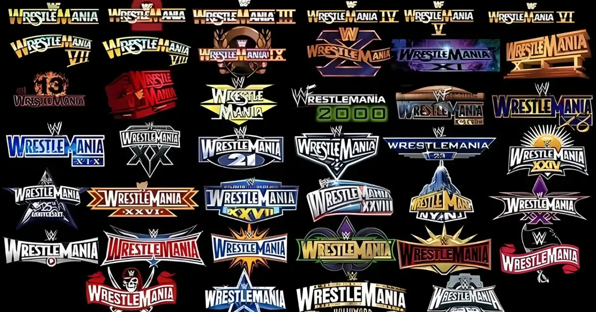
WrestleMania continues to stand as the zenith of sports entertainment, serving as the backdrop for creating moments that are permanently inscribed in the history of wrestling. But, have you ever paid close attention to all the WrestleMania logos? These colorful emblems encapsulate the spirit of each year’s face-off. Over the years, these symbols have undergone significant transformations, reflecting WrestleMania’s journey from a standalone wrestling event to an international spectacle.
Significant Logos and Their Impact
WrestleMania’s logos have not only captured the essence of each event but have also left a lasting impression on fans worldwide. Each logo tells a story, reflecting the unique character and theme of that year’s spectacle.
Most Memorable Designs
Among all WrestleMania logos, certain standouts have become icons in their own right. The WrestleMania III logo, for instance, evokes nostalgia with its bold, block-type font set against a background of classic red, white, and blue. It’s reminiscent of the historic event headlined by Hulk Hogan and Andre the Giant, making it an unforgettable piece of WWE history.

Alternatively, the WrestleMania XXIV logo took inspiration from its Orlando setting with a sunburst motif and sleek silver-and-orange colors, cementing the event’s vibe as bright and energetic, which matched the excitement of that year’s outdoor festivities.

Fan Reactions and Legacy from All WrestleMania Logos
Your experience with WrestleMania is often linked to the visuals that represent it. The logos are more than mere designs; they’re emblems of the memories you hold dear. For instance, fan enthusiasm is still vivid for the WrestleMania X-Seven logo, which was groundbreaking with its edgy and metallic undertones, capturing the peak of the Attitude Era. This design has maintained a cult following, often being cited as the quintessential WrestleMania.

On the other hand, the subtlety and elegance of the WrestleMania 34 logo, with its Mardi Gras beads and deep purple hues, perfectly encapsulated the New Orleans spirit, earning praise for its attention to cultural detail.

Design Elements in WrestleMania Logos
When you think about all WrestleMania logos, they’re not just images; they signify the evolution of a spectacle, each with its unique flair and aesthetic.
Color Schemes
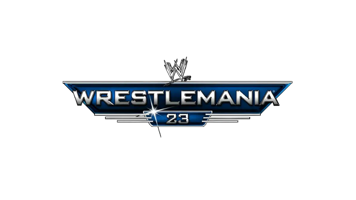
WrestleMania logos often play with a variety of color schemes to capture the event’s vibrancy. For instance, WrestleMania 23 showcased a sleek silver and black color palette, symbolizing the event’s grandiosity, while WrestleMania 35 featured bright tones of yellow and blue, reflecting the energetic ambiance.
- WrestleMania 23: Silver and Black
- WrestleMania 35: Yellow and Blue
Iconic Symbols
The logos incorporate distinctive symbols that resonate with the theme or location of the event. The use of skyline silhouettes or local landmarks is common, like the Empire State Building for WrestleMania 29, signifying its New York setting.
- Empire State Building: WrestleMania 29
- Citrus Fruit: WrestleMania 33 in Orlando

Typography
Typography in WrestleMania logos is designed to convey strength and movement. Bold, block-type fonts are a staple, emphasizing the power and impact of the event. For instance, WrestleMania 32’s logo featured sharp, angular typefaces that exuded dynamism.
- WrestleMania 32: Sharp Angles, Bold Typeface
- WrestleMania 31: Sleek, Modern Font
WrestleMania Logo Design Process
As you explore the evolution of all WrestleMania logos, you’ll find that each symbolizes a unique blend of creativity and industry standards in its design process.
Creative Process
Designing the logo for WrestleMania is a strategic operation that intertwines creative vision with the event’s brand identity. Each year, graphic designers and creative teams brainstorm ideas that will best represent the annual spectacle. They consider factors like the location of the event, the WrestleMania theme, and the current trends in design to come up with a logo that stands out.
Industry Influence
The wrestling entertainment industry has always had an impact on the design of WrestleMania logos. Unlike many other events, WrestleMania’s branding efforts aim to encapsulate the grandeur and excitement of the event, and this is often reflected in the logos. Designers incorporate elements like bold fonts, vivid colors, and iconic imagery that align with the wrestling world’s larger-than-life persona.
History of WrestleMania Logos
As you explore the dynamic visual history of all WrestleMania logos, you’ll discover a rich tapestry of design that captures the grandeur and evolution of this premier sports entertainment event.
Evolution Over Time
The transformation of WrestleMania logos reflects WWE’s growing legacy since the inaugural event in 1985. Initially, the WrestleMania logo had a classic, blockbuster style, emphasizing the event’s significance. Yearly changes soon became a tradition, with each logo encapsulating the theme and location of that year’s spectacle. The dynamic shift from simple numerals and lettering to complex, location-inspired motifs marks WrestleMania’s progression alongside the evolving WWE brand.

The Role of Logos in Branding WrestleMania
When you think about all WrestleMania logos over the years, you’re witnessing more than just design changes; you’re seeing a strategic branding evolution. These logos are not only emblems of each event but also central to WWE’s marketing and merchandising strategies.
Marketing Strategies
Engaging Visuals: Each WrestleMania logo serves a distinct purpose in attracting viewers’ attention and conveying the unique flavor of that year’s event. For instance, WrestleMania 35’s logo proudly displayed the New York skyline, signaling its location at MetLife Stadium, while WrestleMania 36 adapted its logo due to the unforeseen circumstances of the COVID-19 pandemic, emphasizing its shift to the WWE Performance Center.

Consistency and Hype: By revealing a new logo annually, WWE maintains a consistent promotional cycle, which builds anticipation and excitement every year. The announcement of a new logo becomes an event in itself, with each reveal typically met with analysis and fanfare among the community.
Merchandising
Event-specific Gear: The logo is central to WrestleMania’s merchandising strategy. From t-shirts to memorabilia, each logo variation is an opportunity for fans to own a piece of wrestling history.
Collectability: Offering unique designs for every event, WWE taps into the nostalgia and collectability that keep fans purchasing merchandise year after year. Whether it’s for personal use or as collectors’ items, these logos become synonymous with memories and moments from each WrestleMania.
I hope you liked this Post about All Wrestlemania Logos
Let us know what you think about it in the comments.
